by
on 2007/07/24 | [50 Comments]
The Above-the-Fold Myth
We
are all well aware that web design is not an easy task. There are many
variables to consider, some of them technical, some of them human. The
technical considerations of designing for the web can (and do) change
quite regularly, but the human variables change at a slower rate.
Sometimes the human variables change at such a slow rate that we have a
hard time believing that it happens.
This is happening right
now in web design. There is an astonishing amount of disbelief that the
users of web pages have learned to scroll and that they do so
regularly. Holding on to this disbelief – this myth that users won’t
scroll to see anything below the fold – is doing everyone a great
disservice, most of all our users.
First, a definition: The word
“fold” means a great many things, even within the discipline of design.
The most common use of the term “fold” is perhaps used in reference to
newspaper layout. Because of the physical dimensions of the printed
page of a broadsheet newspaper, it is folded. The first page of a
newspaper is where the “big” stories of the issue are because it is the
best possible placement. Readers have to flip the paper over (or unfold
it) to see what else is in the issue, therefore there is a chance that
someone will miss it. In web design, the term “fold” means the line
beyond which a user must scroll to see more contents of a page (if it
exists) after the page displays within their browser. It is also
referred to as a “scroll-line.”
Screen performance data and new
research indicate that users will scroll to find information and items
below the fold. There are established design best practices to ensure
that users recognize when a fold exists and that content extends below
it1. Yet during requirements gathering for design projects
designers are inundated with requests to cram as much information above
the fold as possible, which complicates the information design. Why
does the myth continue, when we have documented evidence that the fold
really doesn’t matter in certain contexts?
Once upon a time, page-level vertical scrolling was not permitted on AOL.
Articles, lists and other content that would have to scroll were
presented in scrolling text fields or list boxes, which our users
easily used. Our pages, which used proprietary technology, were
designed to fit inside a client application, and the strictest of
guidelines ensured that the application desktop itself did not scroll.
The content pages floated in the center of the application interface
and were too far removed from the scrollbar location for users to
notice if a scrollbar appeared. Even if the page appeared to be cut
off, as current best practices dictate, it proved to be such an unusual
experience to our users that they assumed that the application was
“broken.” We had to instill incredible discipline in all areas of the
organization that produced these pages – content creation, design and
development – to make sure our content fit on these little pages.

AOL client application with desktop scrollbar activated
As AOL
moved away from our proprietary screen technology to an open web
experience, we enjoyed the luxury of designing longer (and wider)
pages. Remaining sensitive to the issues of scrolling from our history,
we developed and employed practices for designing around folds:
- We chose as target screen resolutions those used by the majority of our users.
- We identified where the fold would fall in different browsers, and noted the range of pixels that would be in the fold “zone.”
- We
made sure that images and text appeared “broken” or cut off at the fold
for the majority of our users (based on common screen resolutions and
browsers). - We kept the overall page height to no more than 3 screens.
But
even given our new larger page sizes, we were still presented with long
lists of items to be placed above the fold – lists impossible to
accommodate. There were just too many things for the limited amount of
vertical space.
For example, for advertising to be considered
valuable and saleable, a certain percentage of it must appear above the
1024×768 fold. Branding must be above the fold. Navigation must be
above the fold – or at least the beginning of the list of navigational
choices. (If the list is well organized and displayed appropriately,
scanning the list should help bring users down the page.) Big content
(the primary content of the site) should begin above the fold. Some
marketing folks believe that the actual number of data points and links
above the fold is a strategic differentiator critical to business
success. Considering the limited vertical real estate available and the
desire for multiple ad units and functionality described above, an open
design becomes impossible.
And why? Because people think
users don’t scroll. Jakob Nielsen wrote about the growing acceptance
and understanding of scrolling in 19972, yet 10 years later we are still hearing that users don’t scroll.
Research debunking this myth is starting to pop up, and a great example of this is the report available on ClickTale.com3.
In it, the researchers used their proprietary tracking software to
measure the activity of 120,000 pages. Their research gives data on the
vertical height of the page and the point to which a user scrolls. In
the study, they found that 76% of users scrolled and that a good
portion of them scrolled all the way to the bottom, despite the height
of the screen. Even the longest of web pages were scrolled to the
bottom. One thing the study does not capture is how much time is spent
at the bottom of the page, so the argument can be made that users might
just scan it and not pay much attention to any content placed there.
This is where things get interesting.
I took a look at performance data for some AOL
sites and found that items at the bottom of pages are being widely
used. Perhaps the best example of this is the popular celebrity gossip
website TMZ.com. The most clicked on item on the TMZ homepage is the link at the very bottom of the page that takes users to the next page. Note that the TMZ
homepage is often over 15000 pixels long – which supports the ClickTale
research that scrolling behavior is independent of screen height. Users
are so engaged in the content of this site that they are following it
down the page until they get to the “next page” link.
Maybe
it’s not fair to use a celebrity gossip site as an example. After all,
we’re not all designing around such tantalizing guilty-pleasure content
as the downfall of beautiful people. So, let’s look at some drier
content.
For example, take AOL News Daily
Pulse. You’ll notice the poll at the bottom of the page – the vote
counts are well over 300,000 each. This means that not only did folks
scroll over 2000 pixels to the bottom of the page, they actually took
the time to answer a poll while they were there. Hundreds of thousands
of people taking a poll at the bottom of a page can easily be called a
success.
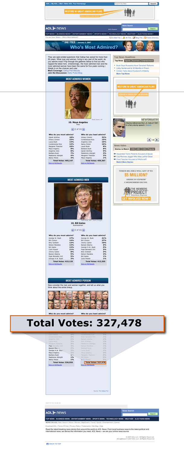
AOL News Daily Pulse with 10×7 fold line and vote count
But,
you may argue, these pages are both in blog format. Perhaps blogs
encourage scrolling more than other types of pages. I’m not convinced,
since blog format is of the “newest content on top” variety, but it may
be true. However, looking at pages that are not in blog format, we see
the same trend. On the AOL Money & Finance
homepage, users find and use the modules for recent quotes and their
personalized portfolios even when these modules are placed well beneath
the 1024×768 fold.
Another example within AOL Money & Finance is a photo gallery entitled Top Tax Tips.
Despite the fact that the gallery is almost 2500 pixels down the page,
this gallery generates between 200,000 and 400,000 page views depending
on promotion of the Taxes page.
It is clear that where a
given item falls in relation to the fold is becoming less important.
Users are scrolling to see what they want, and finding it. The key is
the content – if it is compelling, users will follow where it leads.
When does the fold matter?
The most basic rule of thumb is
that for every site the user should be able to understand what your
site is about by the information presented to them above the fold. If
they have to scroll to even discover what the site is, its success is
unlikely.
Functionality that is essential to business strategy
should remain (or at least begin) above the fold. For example, if your
business success is dependent on users finding a particular thing
(movie theaters, for example) then the widget to allow that action
should certainly be above the fold.
Screen height and folds
matter for applications, especially rapid-fire applications where users
input variables and change the display of information. The input and
output should be in very close proximity. Getting stock quotes is an
example: a user may want to get four or five quotes in sequence, so it
is imperative that the input field and the basic quote information
display remain above the fold for each symbol entered. Imagine the
frustration at having to scroll to find the input field for each quote
you wanted.
Where IS the fold?
Here is perhaps the biggest problem of
all. The design method of cutting-off images or text only works if you
know where the fold is. There is a lot of information out there about
how dispersed the location of fold line actually is. Again, a very
clear picture of this problem is shown on ClickTale. In the same study
of page scrolling, fold locations of viewed screens were captured,
based on screen resolution and browser used. It’s a sad, sad thing, but
the single highest concentration of fold location (at around 600
pixels) for users accounted for less than 10% of the distribution. This
pixel-height corresponds with a screen resolution of 1024×768. Browser
applications take away varying amounts of vertical real estate for
their interfaces (toolbars, address fields, etc). Each browser has a
slightly different size, so not all visitors running a resolution of
1024×768 will have a fold that appears in the same spot. In the
ClickTale study, the three highest fold locations were 570, 590 and 600
pixels—apparently from different browsers running on 1024×768 screens.
But the overall distribution of fold locations for the entire study was
so varied that even these three sizes together only account for less
than 26% of visits. What does all this mean? If you pick one pixel
location on which to base the location of the fold when designing your
screens, the best-case scenario is that you’ll get the fold line
exactly right for only 10% of your visitors.
So what do we do now?
Stop worrying about the fold. Don’t
throw your best practices out the window, but stop cramming stuff above
a certain pixel point. You’re not helping anyone. Open up your designs
and give your users some visual breathing room. If your content is
compelling enough your users will read it to the end.
Advertisers
currently want their ads above the fold, and it will be a while before
that tide turns. But it’s very clear that the rest of the page can be
just as valuable – perhaps more valuable – to contextual advertising.
Personally, I’d want my ad to be right at the bottom of the TMZpage,
forget the top.
The biggest lesson to be learned here is
that if you use visual cues (such as cut-off images and text) and
compelling content, users will scroll to see all of it. The next great
frontier in web page design has to be bottom of the page. You’ve done
your job and the user scrolled all the way to the bottom of the page
because they were so engaged with your content. Now what? Is a footer
really all we can offer them? If we know we’ve got them there, why not
give them something to do next? Something contextual, a natural next
step in your site, or something with which to interact (such as a poll)
would be welcome and, most importantly, used.
References
1 Jared Spool UIE Brain Sparks, August 2, 2006:Utilizing the Cut-off Look to Encourage Users To Scroll
2 Jakob Nielsen’s Alertbox, December 1, 1997: Changes in Web Usability Since 1994
3 ClickTale’s Research Blog, December 23, 2006: Unfolding the Fold
 Xcitedigital Blog
Leave a comment